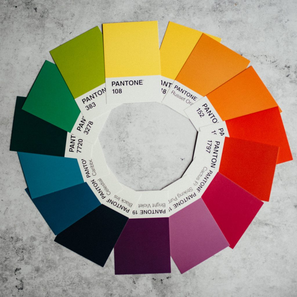
Colour Combinations: What Works & What Doesn’t
Creating fun and interesting colour schemes is one of the most exciting parts of interior design, but it’s not necessarily the easiest.
Whether you think you have a great eye for design or not, there’s always more you can learn about colour, which is why we’re here to give you a crash course.
What is a colour wheel?
To understand how colours interact, the best thing to do is study a colour wheel.
A colour wheel is a way in which we can organise colours visually in order to clearly demonstrate the relationships between them.
A colour wheel consists of primary colours, secondary colours and tertiary colours.
Let’s take a look at this in more detail:
- Primary colours – red, yellow and blue are the traditional primary colours. All colours can be created by mixing these together.
- Secondary colours – secondary colours can be created by mixing primary colours together. These are purple (blue and red), orange (red and yellow) and green (yellow and blue).
- Tertiary colours – tertiary colours are made by mixing together primary and secondary colours. For example, blue-green and red-violet would be classed as tertiary colours.

Warm and cool colours
It can be odd to think of colour as having a temperature, but that’s just one of the ways in which our brains can interpret visual information.
Warm colours are those such as red, yellow and orange, and are often associated with energy, brightness and action.
Cold colours, such as blue, green and purple, are more closely associated with calmness, peace and tranquillity.
This goes some way to explaining why you’re probably more likely to find warm colours in a children’s playroom and cold colours in a bathroom or bedroom.
Different types of colour schemes
While it’s always fun just to smash some colours together to see what looks good, there’s a delicate science behind colour matching which tells us exactly what works and what doesn’t. Here are the different types of colour schemes:
- Complementary colours – these are opposite colours on the colour wheel, such as red and green. They offer a sharp contrast and can really make designs pop, but using them too much can be a little overwhelming.
- Analogous colours – these colours sit next to each other on the colour wheel. For example – red, yellow and orange. When you create an analogous colour scheme, one colour will dominate (in this scenario, it will be red) and the other two will play a supporting role.
- Triadic colours – evenly spaced around the colour wheel, triadic colours tend to make bright and dynamic schemes with each colour standing out in its own right.
When trying to decide on colour themes for a particular room, it can help to take a look at a colour wheel to see what sort of scheme you would like to go for and what sort of effect it might have on someone.
Analogous colours are often used in interior design schemes because they tend to be more soothing and easier to look at.
Conversely, you’ll often find triadic colours used in branding and trainer design, as these tend to be a little more eye-catching.
Are you looking to redesign your home? Whether it’s carpets, curtains or blinds, the team here at John Frederick will be able to help you choose the perfect products to ensure that all of the colours in your home work in harmony. Interested? Great, don’t hesitate to get in touch today.
John Frederick is based in Hendon, but provides cleaning services throughout the Greater London area, including Chelsea, Kensington, Ascot & Weybridge. John Frederick’s are expert carpet, upholstery, curtain & blind cleaners. They also supply a wide range of curtains & blinds and carpet & flooring options to customers throughout London.


